Introduction
Data visualization tools help organizations transform raw data into charts, dashboards, and interactive visual insights. In simple terms, these platforms allow users to explore data visually instead of reading rows and columns, making it easier to identify patterns, trends, and anomalies. Whether it’s a sales dashboard, marketing performance report, or executive KPI view, data visualization tools play a critical role in turning data into actionable decisions.
This category is more important than ever because businesses generate massive volumes of data across systems like CRM, ERP, analytics platforms, and data warehouses. Without proper visualization, even high-quality data can remain underutilized. Modern tools go beyond static charts and offer real-time dashboards, AI-assisted insights, embedded analytics, and self-service exploration, making them essential for data-driven organizations.
Common use cases include:
- Business intelligence dashboards
- Sales and marketing performance tracking
- Financial reporting and forecasting
- Product analytics and user behavior insights
- Operational monitoring and KPI tracking
Buyers should evaluate:
- Ease of use and learning curve
- Visualization flexibility and customization
- Data connectivity and integration support
- Dashboard performance and scalability
- Collaboration and sharing capabilities
- Real-time and live data support
- Security and governance controls
- AI and advanced analytics features
- Embedding and API capabilities
- Pricing and licensing model
Best for: analysts, business users, executives, data teams, and organizations that need to make decisions based on data. Suitable for SMBs, mid-market, and enterprise environments.
Not ideal for: teams that only need basic reporting or spreadsheets. If your use case is simple, lightweight tools may be enough.
Key Trends in Data Visualization Tools
- AI-powered insights and natural language queries are growing rapidly
- Self-service analytics is becoming a standard requirement
- Real-time dashboards are increasingly expected
- Embedded analytics is expanding across applications
- Cloud-based BI tools dominate new deployments
- Data storytelling features are improving
- Integration with data warehouses and lakes is critical
- Collaboration and sharing capabilities are evolving
- Mobile-friendly dashboards are gaining importance
- Focus on performance and scalability is increasing
How We Chose These Data Visualization Tools (Methodology)
We selected the Top 10 tools based on:
- Market adoption and popularity
- Visualization capabilities and flexibility
- Integration ecosystem and data connectivity
- Ease of use for technical and non-technical users
- Performance and scalability
- Security and governance features
- Support for modern data stacks
- Innovation in AI and analytics features
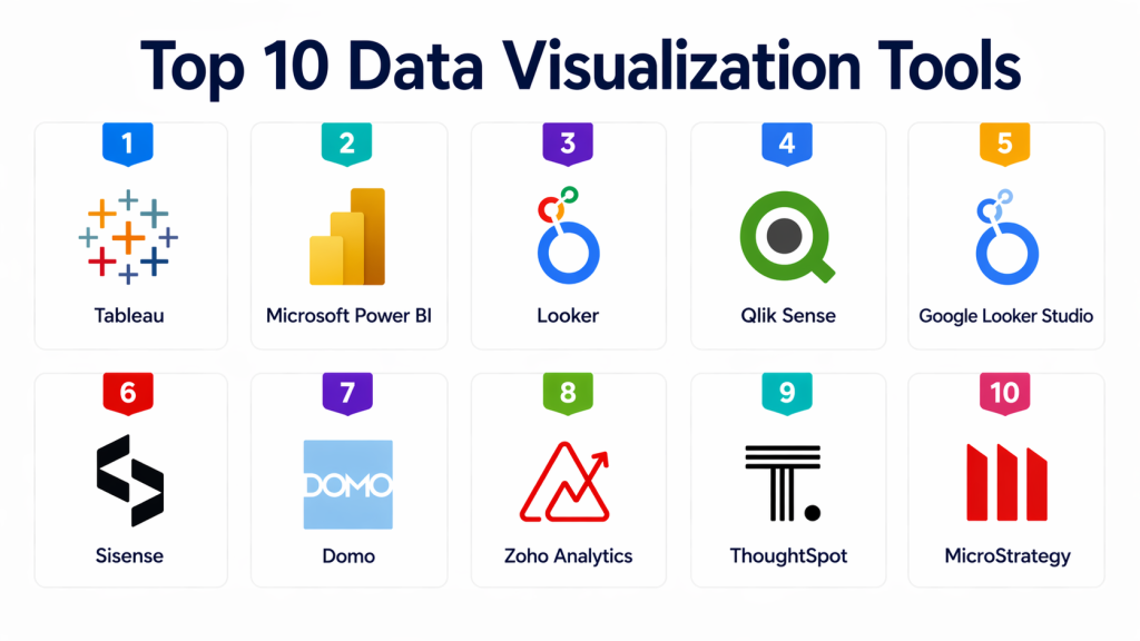
Top 10 Data Visualization Tools
#1 — Tableau
Short description : Tableau is one of the most widely used data visualization tools, known for its powerful analytics and rich visualizations. It enables users to create interactive dashboards and explore data intuitively. Tableau supports a wide range of data sources and offers strong enterprise capabilities. It is suitable for both beginners and advanced users. A top choice for data-driven organizations.
Key Features
- Interactive dashboards
- Advanced visualization capabilities
- Drag-and-drop interface
- Wide data source connectivity
- Real-time analytics
- Data storytelling features
Pros
- Highly flexible visualizations
- Strong community support
- Powerful analytics capabilities
Cons
- Expensive licensing
- Performance issues with large datasets
- Learning curve for advanced features
Platforms / Deployment
Cloud / Desktop / Server
Security & Compliance
Supports enterprise-grade security and governance controls.
Integrations & Ecosystem
Integrates with data warehouses, cloud platforms, and BI tools.
Support & Community
Large global community and strong documentation.
#2 — Microsoft Power BI
Short description : Power BI is a leading business intelligence tool from Microsoft. It provides strong integration with Microsoft products and offers powerful visualization capabilities. Power BI is known for its affordability and ease of use. It supports real-time dashboards and AI insights. A popular choice for organizations using Microsoft ecosystem.
Key Features
- Interactive dashboards
- AI-powered insights
- Integration with Microsoft tools
- Real-time data streaming
- Data modeling capabilities
- Custom visualizations
Pros
- Affordable pricing
- Easy to use
- Strong Microsoft integration
Cons
- Limited customization compared to Tableau
- Performance limitations at scale
- Best within Microsoft ecosystem
Platforms / Deployment
Cloud / Desktop
Security & Compliance
Supports enterprise security and compliance standards.
Integrations & Ecosystem
Strong integration with Microsoft ecosystem.
Support & Community
Large user base and strong support.
#3 — Looker
Short description : Looker is a modern data platform focused on modeling and visualization. It enables users to create dashboards based on a centralized data model. Looker is especially useful for organizations adopting modern data stacks. It provides strong governance and scalability. A good choice for data-driven teams.
Key Features
- Data modeling layer
- Interactive dashboards
- Embedded analytics
- API-driven platform
- Real-time data access
- Governance features
Pros
- Strong data modeling
- Scalable architecture
- Good for modern data stacks
Cons
- Requires technical setup
- Expensive
- Learning curve
Platforms / Deployment
Cloud
Security & Compliance
Supports enterprise governance and access control.
Integrations & Ecosystem
Works well with modern data warehouses.
Support & Community
Growing enterprise adoption.
#4 — Qlik Sense
Short description : Qlik Sense is a data analytics and visualization platform known for its associative data model. It allows users to explore data freely without predefined queries. Qlik offers strong analytics capabilities and interactive dashboards. It is suitable for enterprise environments. A powerful BI tool.
Key Features
- Associative data model
- Interactive dashboards
- AI-driven insights
- Data exploration capabilities
- Integration support
- Scalability
Pros
- Flexible data exploration
- Strong analytics
- Enterprise-ready
Cons
- Complex interface
- Learning curve
- Expensive
Platforms / Deployment
Cloud / On-prem
Security & Compliance
Supports enterprise security controls.
Integrations & Ecosystem
Integrates with data platforms and BI tools.
Support & Community
Strong enterprise support.
#5 — Google Looker Studio
Short description : Looker Studio is a free data visualization tool from Google. It allows users to create dashboards and reports easily. It integrates well with Google products. It is suitable for small and medium businesses. A lightweight BI solution.
Key Features
- Free dashboards
- Google integration
- Easy sharing
- Data connectors
- Custom reports
- Real-time data
Pros
- Free to use
- Easy setup
- Good for SMBs
Cons
- Limited advanced features
- Performance limitations
- Less enterprise depth
Platforms / Deployment
Cloud
Security & Compliance
Supports standard security controls.
Integrations & Ecosystem
Works with Google ecosystem.
Support & Community
Large user base.
#6 — Sisense
Short description : Sisense is a powerful analytics platform designed for embedding dashboards into applications. It is known for its flexibility and performance. Sisense supports large-scale data analysis and visualization. It is suitable for developers and enterprises. A strong embedded analytics tool.
Key Features
- Embedded analytics
- Interactive dashboards
- Data modeling
- API support
- Scalability
- Performance optimization
Pros
- Strong embedding capabilities
- Flexible platform
- High performance
Cons
- Complex setup
- Higher cost
- Requires technical expertise
Platforms / Deployment
Cloud / Hybrid
Security & Compliance
Supports enterprise-grade security.
Integrations & Ecosystem
Works with modern data platforms.
Support & Community
Enterprise support available.
#7 — Domo
Short description : Domo is a cloud-based business intelligence platform that provides dashboards and analytics tools. It focuses on real-time data and collaboration. Domo is suitable for business users and executives. It offers strong integration capabilities. A comprehensive BI solution.
Key Features
- Real-time dashboards
- Collaboration tools
- Data connectors
- Mobile access
- Data integration
- AI insights
Pros
- Strong collaboration
- Real-time analytics
- Easy to use
Cons
- Expensive
- Customization limitations
- Learning curve
Platforms / Deployment
Cloud
Security & Compliance
Supports enterprise security.
Integrations & Ecosystem
Broad integration support.
Support & Community
Strong enterprise support.
#8 — Zoho Analytics
Short description : Zoho Analytics is a business intelligence tool designed for SMBs. It offers easy-to-use dashboards and reporting features. Zoho integrates well with its ecosystem. It is affordable and scalable. A good option for smaller organizations.
Key Features
- Dashboard creation
- Data blending
- AI insights
- Integration with Zoho apps
- Custom reports
- Collaboration
Pros
- Affordable
- Easy to use
- Good for SMBs
Cons
- Limited enterprise features
- Performance issues at scale
- Smaller ecosystem
Platforms / Deployment
Cloud
Security & Compliance
Supports standard security controls.
Integrations & Ecosystem
Strong Zoho ecosystem integration.
Support & Community
Growing user base.
#9 — Chartio
Short description : Chartio was a cloud-based BI tool focused on simplicity and ease of use. It allowed users to create dashboards without heavy technical knowledge. It was popular among SMBs. Known for simplicity. A lightweight option.
Key Features
- Dashboard creation
- Data exploration
- Easy interface
- Cloud-based
- Integration support
- Reporting tools
Pros
- Easy to use
- Good for beginners
- Simple setup
Cons
- Limited features
- Not enterprise-grade
- Smaller ecosystem
Platforms / Deployment
Cloud
Security & Compliance
Supports basic security features.
Integrations & Ecosystem
Works with cloud data sources.
Support & Community
Limited community.
#10 — ThoughtSpot
Short description : ThoughtSpot is a modern analytics platform focused on search-driven analytics. It allows users to query data using natural language. ThoughtSpot is known for AI-driven insights. It is suitable for enterprises. A strong modern BI tool.
Key Features
- Search-driven analytics
- AI insights
- Interactive dashboards
- Data modeling
- Real-time analytics
- Integration support
Pros
- AI-powered insights
- Easy search interface
- Modern platform
Cons
- Expensive
- Requires setup
- Learning curve
Platforms / Deployment
Cloud
Security & Compliance
Supports enterprise security controls.
Integrations & Ecosystem
Works with modern data stacks.
Support & Community
Enterprise support available.
Comparison Table (Top 10)
| Tool Name | Best For | Platform(s) Supported | Deployment | Standout Feature | Public Rating |
|---|---|---|---|---|---|
| Tableau | Advanced visualization | Web / Desktop | Cloud / Server | Rich visualizations | N/A |
| Power BI | Microsoft users | Web / Desktop | Cloud | Affordable BI | N/A |
| Looker | Data modeling | Web | Cloud | Semantic layer | N/A |
| Qlik Sense | Data exploration | Web | Cloud / On-prem | Associative model | N/A |
| Looker Studio | Free dashboards | Web | Cloud | Free tool | N/A |
| Sisense | Embedded analytics | Web | Cloud / Hybrid | Embedding | N/A |
| Domo | Business dashboards | Web | Cloud | Real-time data | N/A |
| Zoho Analytics | SMB analytics | Web | Cloud | Affordable | N/A |
| Chartio | Simple BI | Web | Cloud | Ease of use | N/A |
| ThoughtSpot | AI analytics | Web | Cloud | Search-based BI | N/A |
Evaluation & Scoring of Data Visualization Tools
| Tool Name | Core | Ease | Integrations | Security | Performance | Support | Value | Total |
|---|---|---|---|---|---|---|---|---|
| Tableau | 9.5 | 8.0 | 9.0 | 9.0 | 9.0 | 9.2 | 7.5 | 8.88 |
| Power BI | 9.0 | 9.0 | 8.8 | 9.0 | 8.5 | 9.0 | 9.0 | 8.96 |
| Looker | 8.8 | 7.5 | 9.0 | 9.0 | 8.8 | 8.8 | 7.5 | 8.52 |
| Qlik Sense | 8.7 | 7.0 | 8.5 | 9.0 | 8.8 | 8.7 | 7.5 | 8.32 |
| Looker Studio | 7.5 | 9.0 | 8.0 | 8.0 | 7.8 | 8.0 | 9.5 | 8.11 |
| Sisense | 8.5 | 7.5 | 8.8 | 9.0 | 8.8 | 8.5 | 7.8 | 8.34 |
| Domo | 8.3 | 8.5 | 8.5 | 8.8 | 8.5 | 8.5 | 7.5 | 8.30 |
| Zoho Analytics | 7.8 | 8.8 | 8.0 | 8.2 | 7.8 | 8.0 | 9.0 | 8.10 |
| Chartio | 7.0 | 8.5 | 7.5 | 7.5 | 7.5 | 7.5 | 8.5 | 7.66 |
| ThoughtSpot | 8.6 | 8.0 | 8.5 | 9.0 | 8.8 | 8.7 | 7.8 | 8.42 |
Which Data Visualization Tool Is Right for You?
Solo / Freelancer
Looker Studio or Zoho Analytics
SMB
Power BI, Zoho Analytics
Mid-Market
Tableau, Qlik Sense, Domo
Enterprise
Tableau, Looker, ThoughtSpot
Frequently Asked Questions (FAQs)
1. What is a data visualization tool?
A data visualization tool helps users convert raw data into visual formats like charts, graphs, and dashboards. These visuals make it easier to understand complex datasets and identify trends or patterns. Instead of manually analyzing spreadsheets, users can quickly gain insights through interactive visuals. These tools are widely used in business intelligence and analytics workflows. They play a key role in data-driven decision-making.
2. Why is data visualization important?
Data visualization is important because it simplifies complex information and makes it easier to interpret. Visuals help stakeholders quickly understand performance metrics and trends without deep technical knowledge. This improves communication across teams and supports faster decision-making. It also helps identify anomalies and opportunities that might be missed in raw data. Overall, it enhances the impact of data analysis.
3. Who uses data visualization tools?
These tools are used by data analysts, business analysts, executives, marketing teams, finance teams, and operations professionals. Analysts use them to explore and present data, while executives rely on dashboards for strategic decisions. Business users benefit from easy-to-understand visuals without needing technical expertise. Data visualization tools bridge the gap between technical and non-technical users. They are essential across all departments.
4. Are data visualization tools cloud-based?
Most modern data visualization tools are cloud-based, allowing users to access dashboards from anywhere. Cloud deployment also enables real-time collaboration and easier integration with cloud data sources. However, some tools offer on-premise or hybrid options for organizations with strict security requirements. Cloud-based tools are generally easier to maintain and scale. The choice depends on infrastructure and compliance needs.
5. Do data visualization tools support real-time data?
Yes, many modern tools support real-time or near real-time data updates. This allows users to monitor live metrics such as sales performance, website traffic, or operational KPIs. Real-time dashboards are especially useful for time-sensitive decision-making. However, not all use cases require real-time data, and batch updates may be sufficient in some scenarios. Buyers should evaluate their specific needs before choosing a tool.
6. Are data visualization tools expensive?
The cost of data visualization tools varies depending on the vendor, features, and scale of usage. Some tools offer free or low-cost plans suitable for small teams, while enterprise solutions can be expensive. Pricing often depends on the number of users, data volume, and advanced capabilities. Organizations should consider total cost of ownership, including licensing and maintenance. Choosing the right tool depends on budget and requirements.
7. Can these tools integrate with databases?
Yes, most data visualization tools can connect to a wide range of databases, data warehouses, and cloud platforms. This allows users to pull data directly into dashboards without manual exports. Integration is a critical feature when evaluating tools. Strong connectivity ensures seamless data flow and accurate reporting. Compatibility with your existing data stack is essential.
8. Are data visualization tools easy to use?
Many modern tools are designed with user-friendly interfaces and drag-and-drop functionality. This allows non-technical users to create dashboards without coding skills. However, advanced features like data modeling and complex analytics may require training. Ease of use varies across tools, so usability should be a key consideration. Proper onboarding can significantly improve adoption.
9. Do data visualization tools support AI features?
Yes, many tools now include AI-powered capabilities such as automated insights, natural language queries, and predictive analytics. These features help users discover trends and patterns without manual analysis. AI can also assist in generating recommendations and identifying anomalies. This makes data analysis more accessible and efficient. AI-driven features are becoming a key differentiator.
10. Which data visualization tool is best?
There is no single “best” tool, as the right choice depends on your organization’s needs, budget, and technical environment. Tools like Tableau and Power BI are popular for enterprise use, while others like Looker Studio are better for lightweight use cases. The best approach is to evaluate multiple tools based on your requirements. Running a pilot project can help determine the best fit. Always prioritize usability, integration, and scalability.
Conclusion
Data visualization tools have become a core component of modern data-driven organizations, enabling teams to transform raw data into meaningful insights that drive better decisions. As data volumes continue to grow, the ability to quickly interpret and communicate information through dashboards and visual reports is more important than ever. These tools not only improve understanding but also enhance collaboration across technical and non-technical teams. Whether it’s tracking KPIs, analyzing customer behavior, or monitoring operations, visualization platforms play a critical role in making data actionable.
The right tool depends on your organization’s size, data maturity, and ecosystem. Enterprise solutions like Tableau, Power BI, and Looker offer deep capabilities, while tools like Looker Studio and Zoho Analytics provide simpler, cost-effective options for smaller teams. Instead of focusing on a single winner, shortlist tools that align with your requirements and test them in real scenarios. Evaluate ease of use, performance, and integration capabilities before making a decision. A well-chosen data visualization tool can significantly improve how your organization uses and benefits from data.